When I bought my 1962 ranch house four years ago, the original kitchen floor tiles were hidden under three layers of vinyl that previous owners had installed over the decades. The day I finally peeled back those layers and discovered the pristine geometric black and white tiles underneath was like finding buried treasure. That discovery sparked my obsession with authentic mid century design and led me down a path of research, restoration, and eventually a complete kitchen renovation that honors the home’s original era. Now, every morning when I walk barefoot across those perfectly preserved tiles, I’m reminded of why mid-century design has such enduring appeal.
Authentic Mid Century Tile Materials and Patterns
Terrazzo became my gold standard for authentic mid century flooring after I discovered its prevalence in 1950s and 60s homes. The speckled surface created by marble chips embedded in cement perfectly captures that era’s love for both functionality and visual interest. I found original terrazzo samples at architectural salvage yards that helped me understand the authentic color palettes, typically featuring neutral bases with colorful aggregate pieces. The seamless installation and easy maintenance made terrazzo a practical choice for busy post-war families.
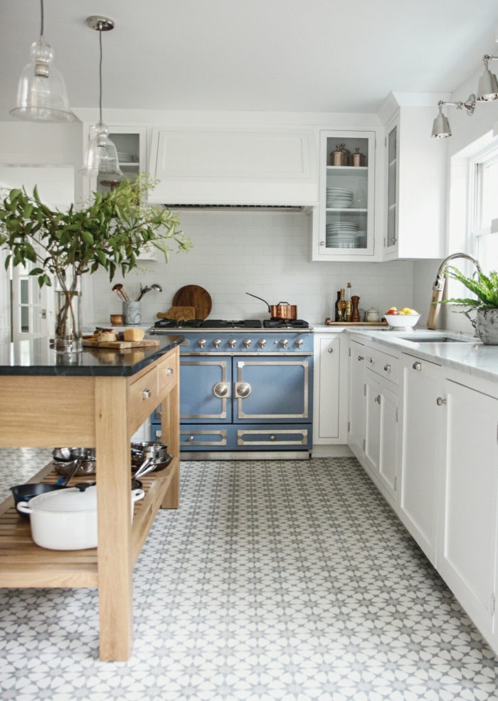
Vinyl composition tile, or VCT, dominated mid century kitchens because of its affordability and bold color options that reflected the optimism of the era. I studied countless vintage home magazines and discovered that homeowners embraced vibrant combinations like turquoise and coral, or sunny yellow with crisp white. The 9-inch square format created clean grid patterns that emphasized the geometric sensibilities of mid century design. While original VCT can contain asbestos, modern reproductions capture the same aesthetic safely.
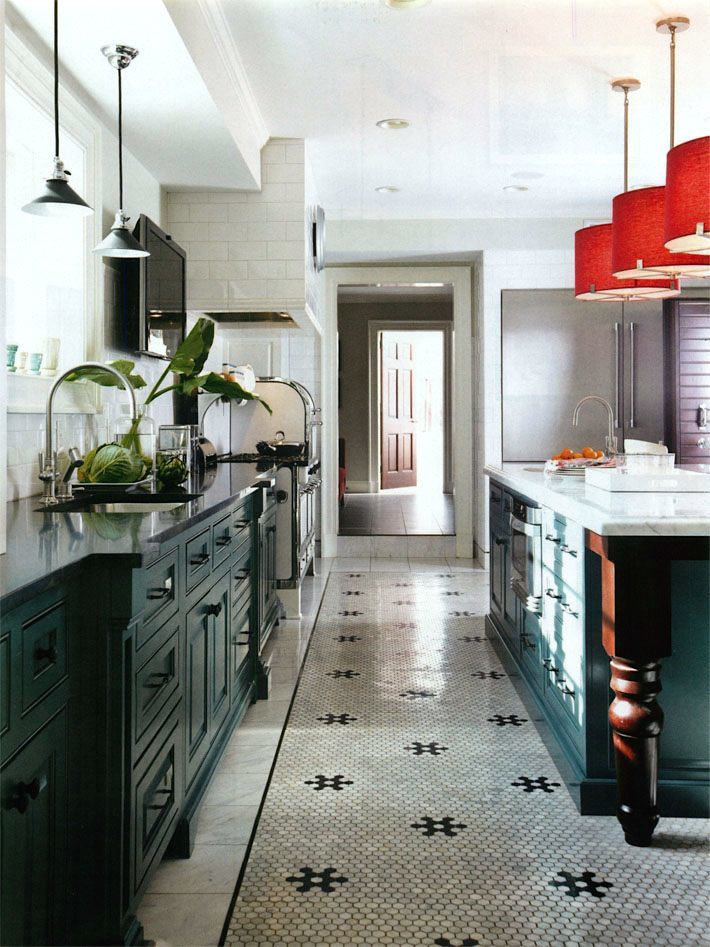
Ceramic mosaic tiles in small square formats created the intricate patterns that defined upscale mid century kitchens. I found examples of original installations featuring 1-inch squares in sophisticated color combinations, often incorporating metallic gold or copper accents that reflected the era’s space-age influences. The precision required for these installations demonstrated the period’s emphasis on craftsmanship and attention to detail. Many manufacturers now produce authentic reproductions that capture the original glazes and proportions perfectly.
Color Schemes That Define the Era
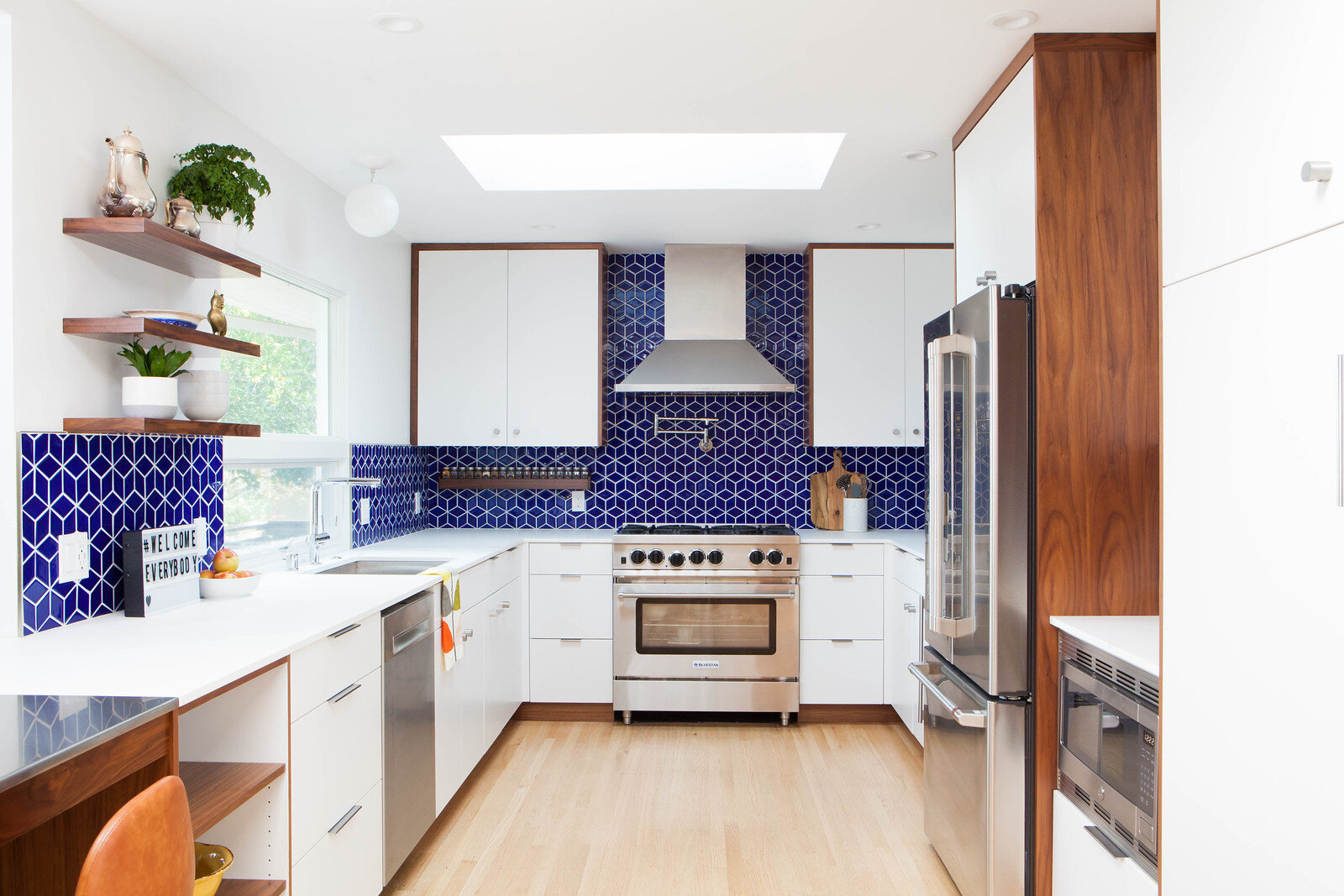
Bold primary colors dominated my research into authentic mid century palettes, reflecting the era’s break from traditional decorating conventions. I discovered that homeowners embraced vibrant reds, electric blues, and sunny yellows in combinations that would have seemed shocking to previous generations. These confident color choices expressed the optimism and prosperity of post-war America, when new synthetic materials made previously impossible hues affordable and durable. The psychological impact of these bright spaces supported the era’s emphasis on modern living and forward thinking.
Sophisticated neutrals provided balance in mid century design, often serving as grounding elements for bolder accent colors. I learned to appreciate the subtle complexity of period grays, which ranged from warm putty tones to cool charcoal shades that complemented the era’s love for natural materials like wood and stone. Crisp whites appeared frequently, but always with slight warm or cool undertones that prevented the sterile appearance that pure white might create. These neutrals allowed the architecture and furnishings to take center stage.
Unexpected color combinations challenged traditional decorating rules and created the distinctive look that makes mid century design instantly recognizable. I experimented with period-appropriate pairings like mint green with coral pink, or turquoise with chocolate brown, discovering how these unconventional combinations create dynamic visual tension. The key was understanding that mid century designers used color strategically, often employing the 60-30-10 rule with neutral backgrounds, significant secondary colors, and bold accent hues that energized the entire space.

Installation Techniques for Period Accuracy
Substrate preparation became crucial when I decided to install reproduction mid century tiles in my kitchen, as the era’s installation methods differed significantly from modern techniques. I learned that original installations typically used thick mortar beds that created perfectly level surfaces, essential for the precise geometric patterns that define mid century style. Working with a contractor experienced in historical renovation ensured that we used period-appropriate underlayment materials and techniques. The extra effort resulted in installations that look and feel authentic to the era.
Layout planning required mathematical precision to achieve the clean, geometric patterns that characterize mid century tile work. I spent hours creating detailed drawings and templates, understanding that even small deviations from perfect alignment would be glaringly obvious in the stark geometric patterns. Starting from the center point of the room and working outward prevented the awkward partial tiles that can ruin the visual impact of these designs. The process demanded patience but resulted in installations that truly capture the era’s emphasis on precision and order.
Grout selection and application proved more important than I initially realized, as the grout lines significantly impact the overall appearance of geometric tile patterns. I learned that period installations typically used contrasting grout colors to emphasize the graphic nature of the patterns, rather than trying to hide the grid lines. The width and consistency of grout lines required careful attention, as variations would destroy the clean, modern aesthetic that defines mid century style. Professional installation ensured the precision necessary for authentic results.
Modern Reproductions vs. Vintage Originals
Hunting for original vintage tiles taught me to recognize the subtle differences in glazes, dimensions, and manufacturing techniques that distinguish authentic pieces from modern reproductions. I spent weekends scouring architectural salvage yards and estate sales, learning to identify the slightly irregular surfaces and unique color variations that characterize handcrafted mid century tiles. Original pieces often show the beautiful patina of age while maintaining their structural integrity, creating installations with character that new tiles simply cannot match.
Quality reproductions have improved dramatically in recent years, with several manufacturers creating tiles that faithfully capture the dimensions, colors, and surface textures of original mid century designs. I compared numerous reproduction options and found that the best versions accurately reproduce not just the visual appearance but also the tactile qualities of vintage tiles. The advantage of reproductions includes consistent availability, predictable quality, and the absence of potential hazardous materials that might be present in original tiles from that era.
Cost considerations ultimately influenced my decision between original and reproduction tiles, as authentic vintage pieces command premium prices when available in sufficient quantities. I discovered that mixing carefully selected reproductions with a few original accent pieces could create authentic-looking installations at more reasonable costs. This hybrid approach allowed me to achieve the desired aesthetic while staying within budget, proving that perfect historical accuracy isn’t always necessary to capture the spirit of mid century design.
Maintenance and Longevity Considerations
Daily care of mid century tiles requires understanding the specific characteristics of different materials and finishes from that era. I learned that the glazes and surface treatments used in the 1950s and 60s often differ from modern versions, requiring gentler cleaning products and techniques. Regular sweeping and damp mopping with pH-neutral cleaners maintains the original luster while preventing the buildup of grime in grout lines. The key is consistency rather than intensive cleaning sessions that might damage delicate vintage surfaces.
Long-term preservation of authentic mid century tiles demands attention to environmental factors that can cause deterioration over time. I monitor humidity levels and temperature fluctuations that can cause expansion and contraction, potentially loosening tiles or cracking grout lines. Periodic professional cleaning and resealing helps protect the investment while maintaining the authentic appearance. Understanding the specific needs of different tile materials ensures that these beautiful floors will continue looking their best for decades to come.
Repair and restoration techniques for vintage tiles require specialized knowledge and materials that may not be readily available through conventional channels. I’ve learned to work with craftspeople who understand historical installation methods and have access to period-appropriate repair materials. Preventive maintenance proves more cost-effective than major restoration projects, so I address small issues promptly before they become significant problems. Building relationships with specialists in mid century restoration provides ongoing support for maintaining these unique installations.

Incorporating Mid Century Tiles into Modern Kitchens
Balancing authenticity with contemporary functionality challenged my design approach when renovating my mid century kitchen. I wanted to honor the home’s original era while incorporating modern conveniences that make daily life more comfortable. The solution involved carefully selecting reproduction tiles that captured the authentic aesthetic while meeting current durability and safety standards. This approach allowed me to create a space that feels genuinely vintage while functioning perfectly for modern cooking and entertaining needs.
Lighting design significantly impacts how mid century tiles appear in contemporary settings, as the era’s emphasis on dramatic shadows and highlights can be enhanced or diminished by fixture choices. I installed period-appropriate pendant lights and under-cabinet lighting that showcases the geometric patterns and rich colors of the tile installation. The interplay between natural and artificial light sources creates the dynamic visual interest that makes mid century design so compelling. Proper lighting transforms the tiles from mere flooring into an integral part of the overall design statement.
Coordinating mid century tiles with modern appliances and fixtures requires careful attention to scale, proportion, and color relationships. I chose appliances in classic colors like turquoise and pink that complement rather than compete with the tile patterns, while selecting hardware and fixtures that echo the era’s clean lines and geometric forms. The goal was creating a cohesive design that feels authentically mid century while incorporating the technology and convenience that modern families require. Success lies in respecting the original design principles while adapting them to contemporary needs.
Are original mid century tiles safe to install in modern homes?
I always recommend having vintage tiles tested for asbestos and lead content before installation. Many tiles from the 1950s and 60s contain these materials, which require special handling and disposal. Professional testing costs are minimal compared to potential health risks. If hazardous materials are present, high-quality reproductions provide safer alternatives that capture the same aesthetic.
How much should I expect to spend on mid century tile installation?
My kitchen renovation cost about $15 per square foot for quality reproduction tiles with professional installation. Original vintage tiles can cost significantly more when available in sufficient quantities. Labor costs vary by region and complexity of patterns, but expect to pay premium prices for contractors experienced with geometric installations requiring precision alignment and period-appropriate techniques.

Can mid century tiles work in contemporary open-plan kitchens?
I successfully used mid century tiles in my open-plan kitchen by treating them as a defining element that establishes the overall design direction. The key is coordinating adjacent flooring materials and ensuring smooth transitions between spaces. The bold patterns and colors can help define different functional areas within larger open spaces while maintaining visual continuity throughout the home.
What’s the best way to clean and maintain mid century ceramic tiles?
I use pH-neutral cleaners and avoid abrasive scrubbing that might damage vintage glazes or grout lines. Daily sweeping prevents dirt from accumulating in textured surfaces, while weekly damp mopping maintains the original luster. For stubborn stains, I make a paste with baking soda and water, letting it sit briefly before gentle scrubbing with a soft brush.
Do mid century tile patterns make small kitchens look smaller?
Bold geometric patterns can make spaces appear larger by drawing attention to the floor plane and creating visual interest that distracts from cramped conditions. I found that lighter color combinations and smaller-scale patterns work better in compact kitchens. The key is choosing patterns proportional to the space size and using lighting effectively to showcase the design without overwhelming the room.
How do I find authentic mid century tile patterns and colors?
I researched original patterns through vintage home magazines, architectural archives, and museum collections that document period interiors. Many tile manufacturers now offer reproductions based on their historical archives. Visiting preserved mid century homes and buildings inspires authentic color combinations and installation techniques that capture the true spirit of the era.
Mid-Century Modern Ceramic Tile Kitchen Ideas
Mid Century Modern Flooring Options That Stand The Test of Time
Tile by Style: Midcentury Modern Kitchen Tile Fireclay Tile

Related Posts: